Here’s the final cover of Stop the Clock, my debut novel, which is due to be published on August 16. Let the printing presses roll!
I really hope everybody likes it… I think it’s a beauty. You know that moment when you finally make it to the café, and get to sit down with your cappuccino and have a read? (For me it would probably be a latte, a chocolate brownie and The Fear Index by Robert Harris, which is what I’m reading at the moment.)
It’s just such a luxury: that little bit of time. That’s what this image makes me think of. Also, I like her pink nail varnish!
My other half tells me that in France, they have historically had a quite different attitude to the whole business of covers, and been quite high-minded and gone in for plain white with a title on – though apparently this is beginning to change. Personally, I think the cover is part of the fun of owning the book. Here’s a shortlist of five other covers I really like – you’ll probably remember them, because they’re all the sort that stick in your mind:
- Bridget Jones’s Diary by Helen Fielding – the slightly sepia-tinted chick with the curls and the fag
- One Day by David Nicholls – so good! The silhouette of the lovers’ profiles
- Riders by Jilly Cooper – a model behind looking very fetching in white jodhpurs
- The Devil Wears Prada by Lauren Weisberger – the red high heel turning into a devilish trident
- Captain Corelli’s Mandolin by Louis de Bernières – anyone who was in London in the mid 90s will remember when this jolly blue-and-white cover, which looks like a naive painting, was absolutely everywhere on the Tube.
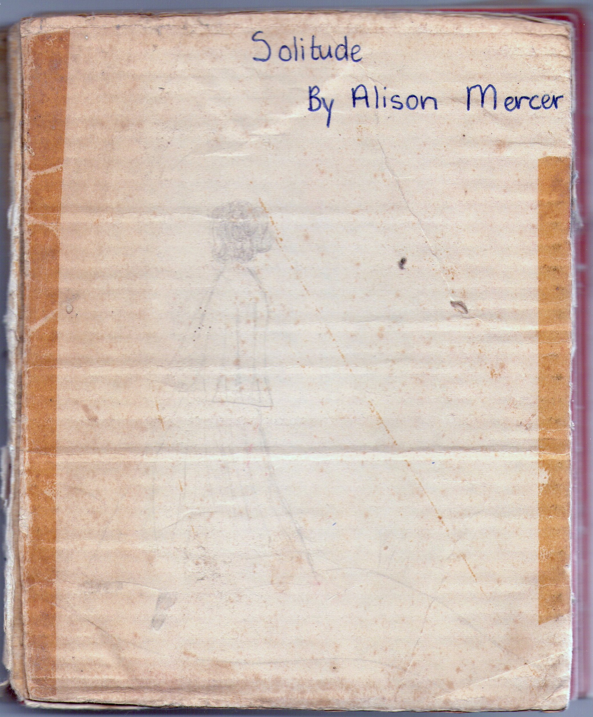
The cover of my other first novel, which I wrote when I was at primary school, has suffered a bit from the passage of time, but you can still just about make it out – here it is!
